Examples
Simple phase
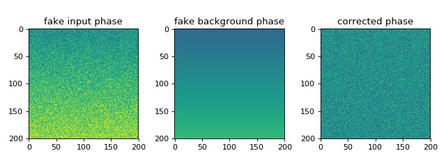
This example illustrates the simple usage of the
qpimage.QPImage class for reading and
managing quantitative phase data. The attribute QPImage.pha yields
the background-corrected phase data and the attribute
QPImage.bg_pha yields the background phase image.
1 2 3 4 5 6 7 8 9 10 11 12 13 14 15 16 17 18 19 20 21 22 23 24 25 26 27 28 29 | import matplotlib.pylab as plt
import numpy as np
import qpimage
size = 200
# background phase image with a ramp
bg = np.repeat(np.linspace(0, 1, size), size).reshape(size, size)
# phase image with random noise
phase = np.random.rand(size, size) + bg
# create QPImage instance
qpi = qpimage.QPImage(data=phase, bg_data=bg, which_data="phase")
# plot the properties of `qpi`
plt.figure(figsize=(8, 3))
plot_kw = {"vmin": -1,
"vmax": 2}
plt.subplot(131, title="fake input phase")
plt.imshow(phase, **plot_kw)
plt.subplot(132, title="fake background phase")
plt.imshow(qpi.bg_pha, **plot_kw)
plt.subplot(133, title="corrected phase")
plt.imshow(qpi.pha, **plot_kw)
plt.tight_layout()
plt.show()
|
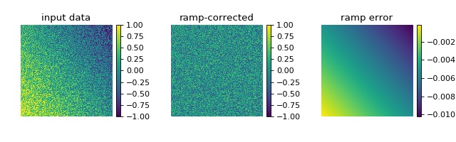
Background image ramp correction
This example illustrates background ramp correction with qpimage.
In contrast to the ‘simple_phase.py’ example, the known background data
is not given to the qpimage.QPImage
class. In this particular example, the background ramp correction
achieves an error of about 1% which is sufficient in most quantitative
phase imaging applications.
1 2 3 4 5 6 7 8 9 10 11 12 13 14 15 16 17 18 19 20 21 22 23 24 25 26 27 28 29 30 31 32 33 34 35 36 37 38 39 40 41 42 43 | import matplotlib.pylab as plt
import numpy as np
import qpimage
size = 200
# background phase image with a ramp
bg = np.repeat(np.linspace(0, 1, size), size).reshape(size, size)
bg = .6 * bg - .8 * bg.transpose() + .2
# phase image with random noise
rsobj = np.random.RandomState(47)
phase = rsobj.rand(size, size) - .5 + bg
# create QPImage instance
qpi = qpimage.QPImage(data=phase, which_data="phase")
# compute background with 2d ramp approach
qpi.compute_bg(which_data="phase", # correct phase image
fit_offset="fit", # use bg offset from ramp fit
fit_profile="ramp", # perform 2D ramp fit
border_px=5, # use 5 px border around image
)
# plot the properties of `qpi`
fig = plt.figure(figsize=(8, 2.5))
plot_kw = {"vmin": -1,
"vmax": 1}
ax1 = plt.subplot(131, title="input data")
map1 = ax1.imshow(phase, **plot_kw)
plt.colorbar(map1, ax=ax1, fraction=.046, pad=0.04)
ax2 = plt.subplot(132, title="ramp-corrected")
map2 = ax2.imshow(qpi.pha, **plot_kw)
plt.colorbar(map2, ax=ax2, fraction=.046, pad=0.04)
ax3 = plt.subplot(133, title="ramp error")
map3 = ax3.imshow(bg - qpi.bg_pha)
plt.colorbar(map3, ax=ax3, fraction=.046, pad=0.04)
# disable axes
[ax.axis("off") for ax in [ax1, ax2, ax3]]
plt.tight_layout(pad=0, h_pad=0, w_pad=0)
plt.show()
|
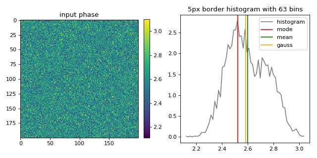
Background image offset correction
This example illustrates the different background offset correction methods implemented in qpimage. The phase image data contains two gaussian noise distributions for which these methods yield different background phase offsets.
1 2 3 4 5 6 7 8 9 10 11 12 13 14 15 16 17 18 19 20 21 22 23 24 25 26 27 28 29 30 31 32 33 34 35 36 37 38 39 40 41 42 43 44 45 46 47 48 49 50 51 52 53 54 55 56 57 58 59 60 61 62 63 64 | import matplotlib.pylab as plt
import numpy as np
import qpimage
size = 200 # the size of the image
bg = 2.5 # the center of the background phase distribution
scale = .1 # the spread of the background phase distribution
# compute random phase data
rsobj = np.random.RandomState(42)
data = rsobj.normal(loc=bg, scale=scale, size=size**2)
# Add a second distribution `data2` at random positions `idx`,
# such that there is no pure gaussian distribution.
# (otherwise 'mean' and 'gaussian' cannot be distinguished)
data2 = rsobj.normal(loc=bg*1.1, scale=scale, size=size**2//2)
idx = rsobj.choice(data.size, data.size//2)
data[idx] = data2
# reshape `data` to get a 2D array
data = data.reshape(size, size)
qpi = qpimage.QPImage(data=data, which_data="phase")
cpkw = {"which_data": "phase", # correct the input phase data
"fit_profile": "offset", # perform offset correction only
"border_px": 5, # use a border of 5px of the input phase
"ret_binary": True, # return the binary image for visualization
}
binary = qpi.compute_bg(fit_offset="mode", **cpkw)
bg_mode = np.mean(qpi.bg_pha[binary])
qpi.compute_bg(fit_offset="mean", **cpkw)
bg_mean = np.mean(qpi.bg_pha[binary])
qpi.compute_bg(fit_offset="gauss", **cpkw)
bg_gauss = np.mean(qpi.bg_pha[binary])
bg_data = (qpi.pha + qpi.bg_pha)[binary]
# compute histogram
nbins = int(np.ceil(np.sqrt(bg_data.size)))
mind, maxd = bg_data.min(), bg_data.max()
histo = np.histogram(bg_data, nbins, density=True, range=(mind, maxd))
dx = abs(histo[1][1] - histo[1][2]) / 2
hx = histo[1][1:] - dx
hy = histo[0]
# plot the properties of `qpi`
plt.figure(figsize=(8, 4))
ax1 = plt.subplot(121, title="input phase")
map1 = plt.imshow(data)
plt.colorbar(map1, ax=ax1, fraction=.046, pad=0.04)
t2 = "{}px border histogram with {} bins".format(cpkw["border_px"], nbins)
plt.subplot(122, title=t2)
plt.plot(hx, hy, label="histogram", color="gray")
plt.axvline(bg_mode, 0, 1, label="mode", color="red")
plt.axvline(bg_mean, 0, 1, label="mean", color="green")
plt.axvline(bg_gauss, 0, 1, label="gauss", color="orange")
plt.legend()
plt.tight_layout()
plt.show()
|
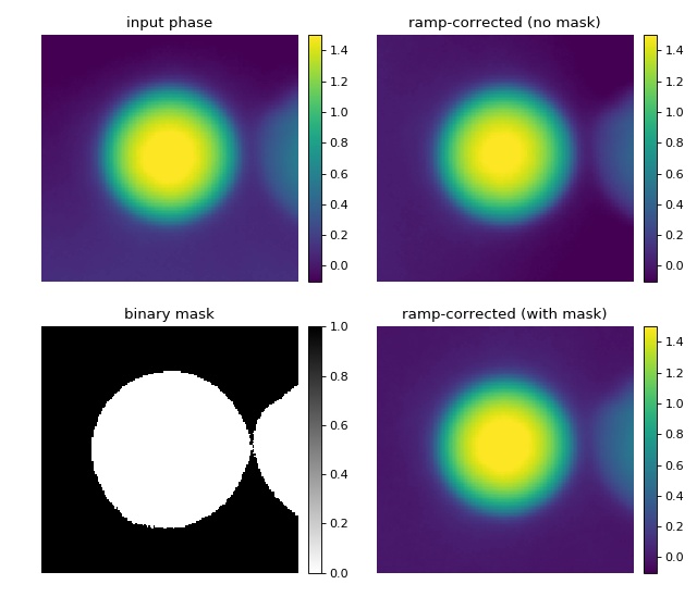
Background image binary mask correction
This example illustrates background correction with qpimage using a binary mask to exclude regions that do not contain background information.
The phase image of a microgel bead (top left) has two artifacts; there is a ramp-like phase profile added along the vertical axis and there is a second microgel bead in close proximity to the center bead. A regular phase ramp background correction using the image values around a frame of five pixels (see “background_ramp.py” example) does not yield a flat background, because the second bead is fitted into the background which leads to a horizontal background phase profile (top right). By defining a binary mask (bottom left image), the phase values of the second bead can be excluded from the background ramp fit and a flat background phase is achieved (bottom right).
1 2 3 4 5 6 7 8 9 10 11 12 13 14 15 16 17 18 19 20 21 22 23 24 25 26 27 28 29 30 31 32 33 34 35 36 37 38 39 40 41 42 43 44 45 46 47 48 49 50 51 52 53 54 55 56 57 58 59 | import matplotlib.pylab as plt
import numpy as np
import qpimage
# load the experimental data
input_phase = np.load("./data/phase_beads_close.npz")["phase"].astype(float)
# create QPImage instance
qpi = qpimage.QPImage(data=input_phase,
which_data="phase")
# background correction without mask
qpi.compute_bg(which_data="phase",
fit_offset="fit",
fit_profile="ramp",
border_px=5,
)
pha_nomask = qpi.pha
# educated guess for binary mask
mask = input_phase < input_phase.max() / 10
# background correction with mask
# (the intersection of `mask` and the 5px border is used for fitting)
qpi.compute_bg(which_data="phase",
fit_offset="fit",
fit_profile="ramp",
border_px=5,
from_binary=mask
)
pha_mask = qpi.pha
# plot
fig = plt.figure(figsize=(8, 7))
plot_kw = {"vmin": -.1,
"vmax": 1.5}
ax1 = plt.subplot(221, title="input phase")
map1 = ax1.imshow(input_phase, **plot_kw)
plt.colorbar(map1, ax=ax1, fraction=.044, pad=0.04)
ax2 = plt.subplot(222, title="ramp-corrected (no mask)")
map2 = ax2.imshow(pha_nomask, **plot_kw)
plt.colorbar(map2, ax=ax2, fraction=.044, pad=0.04)
ax3 = plt.subplot(223, title="binary mask")
map3 = ax3.imshow(mask, cmap="gray_r")
plt.colorbar(map3, ax=ax3, fraction=.044, pad=0.04)
ax4 = plt.subplot(224, title="ramp-corrected (with mask)")
map4 = ax4.imshow(pha_mask, **plot_kw)
plt.colorbar(map4, ax=ax4, fraction=.044, pad=0.04)
# disable axes
[ax.axis("off") for ax in [ax1, ax2, ax3, ax3, ax4]]
plt.tight_layout(h_pad=0, w_pad=0)
plt.show()
|
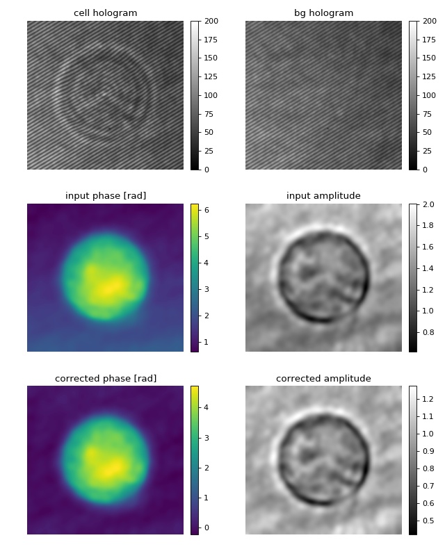
Digital hologram of a single cell
This example illustrates how qpimage can be used to analyze digital holograms. The hologram of a single myeloid leukemia cell (HL60) shown was recorded using digital holographic microscopy (DHM). Because the phase-retrieval method used in DHM is based on the discrete Fourier transform, there always is a residual background phase ramp which must be removed for further image analysis. The setup used for recording this data is described in reference [SSM+15], which also contains a description of the hologram-to-phase conversion and phase background correction algorithms on which qpimage is based.
1 2 3 4 5 6 7 8 9 10 11 12 13 14 15 16 17 18 19 20 21 22 23 24 25 26 27 28 29 30 31 32 33 34 35 36 37 38 39 40 41 42 43 44 45 46 47 48 49 50 51 52 53 54 55 56 57 58 59 60 | import matplotlib
import matplotlib.pylab as plt
import numpy as np
import qpimage
# load the experimental data
edata = np.load("./data/hologram_cell.npz")
# create QPImage instance
qpi = qpimage.QPImage(data=edata["data"],
bg_data=edata["bg_data"],
which_data="hologram")
amp0 = qpi.amp
pha0 = qpi.pha
# background correction
qpi.compute_bg(which_data=["amplitude", "phase"],
fit_offset="fit",
fit_profile="ramp",
border_px=5,
)
# plot the properties of `qpi`
fig = plt.figure(figsize=(8, 10))
matplotlib.rcParams["image.interpolation"] = "bicubic"
holkw = {"cmap": "gray",
"vmin": 0,
"vmax": 200}
ax1 = plt.subplot(321, title="cell hologram")
map1 = ax1.imshow(edata["data"], **holkw)
plt.colorbar(map1, ax=ax1, fraction=.046, pad=0.04)
ax2 = plt.subplot(322, title="bg hologram")
map2 = ax2.imshow(edata["bg_data"], **holkw)
plt.colorbar(map2, ax=ax2, fraction=.046, pad=0.04)
ax3 = plt.subplot(323, title="input phase [rad]")
map3 = ax3.imshow(pha0)
plt.colorbar(map3, ax=ax3, fraction=.046, pad=0.04)
ax4 = plt.subplot(324, title="input amplitude")
map4 = ax4.imshow(amp0, cmap="gray")
plt.colorbar(map4, ax=ax4, fraction=.046, pad=0.04)
ax5 = plt.subplot(325, title="corrected phase [rad]")
map5 = ax5.imshow(qpi.pha)
plt.colorbar(map5, ax=ax5, fraction=.046, pad=0.04)
ax6 = plt.subplot(326, title="corrected amplitude")
map6 = ax6.imshow(qpi.amp, cmap="gray")
plt.colorbar(map6, ax=ax6, fraction=.046, pad=0.04)
# disable axes
[ax.axis("off") for ax in [ax1, ax2, ax3, ax4, ax5, ax6]]
plt.tight_layout()
plt.show()
|